A full house for Kate Tarling on Creating Great Service Organizations

3I7A8390 Kate Tarling Event

On September 26, 2025, OXD welcomed design leader and author Kate Tarling to Emily Carr University of Art + Design for a talk and Q&A on creating great service organizations. The event drew a strong turnout from Vancouver’s service design, management, and leadership community.

We thank Emily Carr University of Art + Design for providing the Rennie Room, with special thanks to Caylee Raber and Otilia Spantulescu from the Health Design Lab for their support.

Want the event recap?

The full event recap will be sent to OXD newsletter subscribers on October 8, 2025. Subscribe below before then to receive it and stay updated on future events.

Converging on service design

Hundreds of people from a range of industries from across five provinces attended the sold out event in Toronto.

If the buzz at this year’s CONVERGE: Canadian Service Design Conference tells us anything, it’s that Canada’s service design community is blooming.

It was great to see participants from the public sector this time around (33% public sector, 52% private sector, 15% academic). And OpenRoad was proud to be there, too, supporting the future of civic design and multi-level service architecture.

OpenRoad partner Gordon Ross speaks at Converge: 2017 Canadian Service Design Conference in Toronto

OpenRoad shares Service Design knowledge

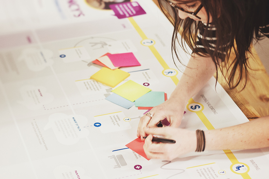
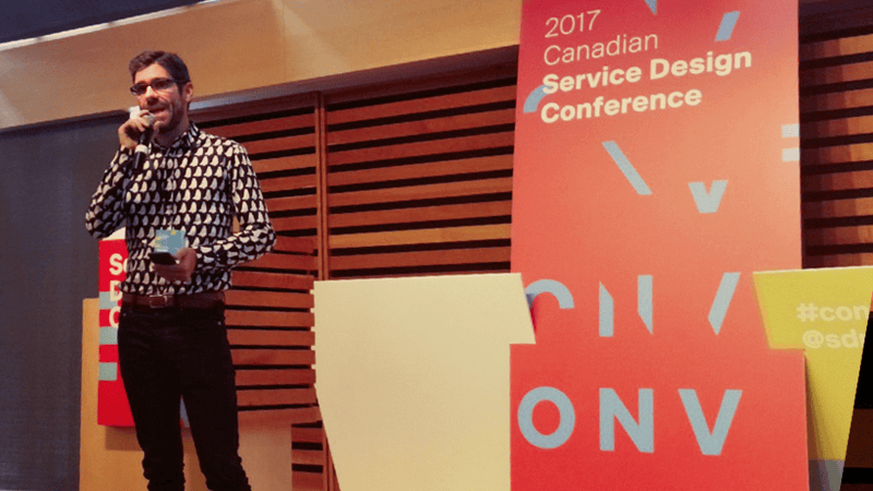
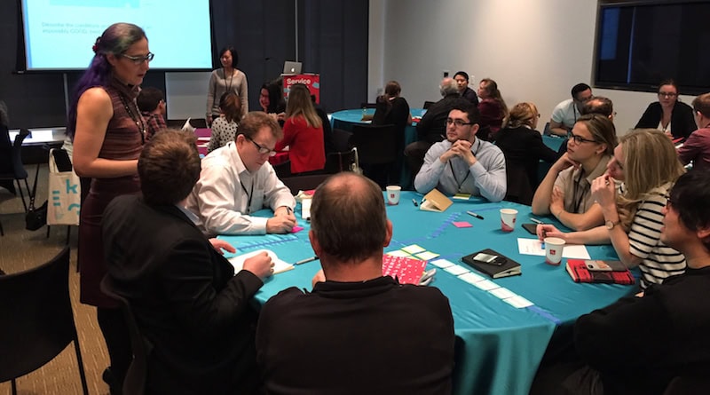
Not only did OpenRoad partner Gordon Ross advise on conference planning and recruiting, but our intrepid Service Design team packed up their tool kits and headed east for the day to facilitate a 90-minute, hands-on workshop, entitled, “A Sampler of Service Design Methods”. With names coming straight out of some utopian science fiction fantasy novel—”Future Backwards”, “Reframing Innovation”, and “Bodystorming”—the workshop methods gave participants the chance to try out some of the tools we use to co-create with our own clients.

Great turnout at OpenRoad's “A Sampler of Service Design Methods” workshop

Learning from our clients

Speaking of our clients, we were thrilled to see a few of them take the stage to share their insights. Our friends from BC’s Government Digital Experience Division (GDX)—Irene Guglielmi and Deanne Young—presented a talk entitled “Let’s get in form-ation.” And Judy Mellett—Director, Service Design, Innovation & Strategy at TELUS—facilitated a dialogue on how to “activate” service design in organizations. Very cool. One particularly inspiring moment came when the BC Government Service Design Team shared their 6-step design model. Using the model, the team squashed the error rate on critical Medical Services Plan forms—from 40% down to an incredible 1%.

Conference attendees and speakers posed “provocations” intended to generate thought and discussion. One particular provocation that resonated with our team was, “We need to expand our focus beyond the table-stakes of user-centricity, towards the ideal of a convergent multi-perspective approach”. Preach it. Later, as our VP Gordon Ross introduced the “Service Design gets Political” track with David Dunne from the University of Victoria, he challenged attendees to contemplate the political dimensions and implications of their work. Who should hold the power in participatory design methods? As service designers, are we simply delivering users to corporations, or are we doing our due diligence to make sure the marginalized have a voice?

Service Design matters

The volume and diversity of attendees speaks to the growing practice and importance of service design in helping to address some deeply-complex, truly-“wicked” problems. Modern experiences are fluid and interconnected. They involve different stakeholders and organizations and systems. These networked problems require multi-pronged, holistic solutions that tap into the experiences, hopes, and ideas of a variety of groups, not just a single design “visionary”. By working with these novel methods, we aim to help our clients spur meaningful change across all kinds of systems.

Want to find out more?

Over the next few months, we’ll be posting more in-depth articles about the methods we facilitated at the conference as well as our service design practice in general. Follow us on social media or sign-up to our newsletter to stay up-to-date with these and other industry thoughts and trends.

OpenRoad Service Design team at Converge: 2017 Canada Service Design Conference in Toronto

Service Designers: expand your palette

OpenRoad is sharing our service design knowledge at Converge 2017

Woman writing post-it notes for service design workshopping

Curious about some of the design methods we use in our client workshops? Well, now you can learn how to use them yourself at Converge!

Jacqueline Antalik, our Director of User Experience, and Deborah MacKenzie, one of our amazing User Experience Designers here at OpenRoad, will lead a compelling workshop that allows participants to sample some of the unique methods we use in our practice. Continue reading "Service Designers: expand your palette"

Helping youth impacted by divorce

Five people standing in a row against the wall

OpenRoad’s recent design for social innovation work gets some early recognition.

In 2016, the BC Family Justice Innovation Lab—a group of volunteers, lawyers, counsellors, and mediators—approached OpenRoad to help them better understand the experience of youth going through divorce with the hope of influencing change within the justice system.

And we’re proud to see the Provincial Court of British Columbia—our home province—recognize the potential of this new approach to justice reform.
Continue reading "Helping youth impacted by divorce"

Congratulations CBC Transmission team!

Award-CBCTransmission--blog

We're pleased to announce that the responsive website we designed and built for CBC/Radio-Canada Transmission has won Best Broadband Website in the 2014 Davey Awards! Congratulations to our talented team of project managers, designers, and developers, and a special "thank you" to our client, the Canadian Broadcasting Corporation.

The CBC Transmission website drives revenue by enabling potential clients to easily find out more about CBC/Radio-Canada Transmission. Whether they're in the office or out in the field, potential clients can use the new website to easily learn about specific CBC towers and service offerings.

Design trends we’re watching in 2014

As a follow-up to our Top Interaction Design Trends 2013 post in December, the design team here at OpenRoad considered some of the trends and buzzwords that might give us a glimpse into what design and technology has in store for us in 2014. Now, we’re not claiming that these are the design trends for 2014, but merely a few of the ones that we find particularly interesting at the moment. So let's dig in...

Connected everything

2014article-connected

Some say it started a few years ago with Nest, who introduced a smart, self-learning thermostat for your home. Soon, we saw an explosion of connected products and product ideas for home automation, including lighting and security systems. But this year, things seem to be moving into overdrive. Clearly, Google thinks so too with their recent $3.2 billion acquisition of Nest, only last week. Wolfram even announced the launch of their new Connected Devices Project, which boasted “a couple of thousand devices” at launch. Continue reading "Design trends we’re watching in 2014"

Top three interaction design trends we love in 2013

In 2013, the web got flatter, simpler, and more mobile-ier. Here's our round-up of three things that really had us singing happy songs as interaction designers this year:

Responsive web design entered the public consciousness

Responsive Design

Responsive Design was something that had us excited for some time now, both in terms of what it could do for the user experience and for our clients' bottom-lines. But it took a bit of time for the concept to gain traction, mainly because it’s a bit of a difficult concept to grasp. So when an entire TV commercial is tooled up to show off Sportsnet’s responsive website, you know RWD has become more than an obscure philosophical approach debated within the web design community. In fact, by some estimates, roughly 1 in 8 websites are now responsive. And we couldn’t be more thrilled. It means more and more sites are accessible to more and more people, devices, and contexts. That’s why we declare 2013 as “The Year Responsive Design Went Mainstream".

Everything’s “flat" now

Flat Design Flat Design

In 2012, the Interwebs were abuzz with the idea of “flat design”—design that scorned unnecessary ornamentation and dubious visual metaphor. Suddenly everyone was an expert interface designer simply because they could use the word “skeuomorphism” in intelligent debate. Fast-forward to 2013, and Apple now led the charge with their much maligned/anticipated iOS 7 redesign. Gone are the gaudy leather trims and faux-distressed metal surfaces. And while we certainly think there’s always room for the affordances inherent in referencing physical objects in screen-based interactive design, we feel the dominant trend towards clean, open, and simple interfaces is generally a pretty good thing.

Hamburgers to go

Hamburger Icon Hamburger Icon

The surge of mobile introduced a new iconography into the broader interaction design lexicon, leading many sites to behave more like apps (especially when viewed on mobile devices). The most notable newcomer was the three-bar symbol affectionally referred to as “the hamburger menu icon”. In 2013, we saw many responsive sites adopt this shorthand to let users know that, hey! there’s a menu under there somewhere. And users responded with a unanimous “OK, I get it!” This allowed designers to hide the navigation until needed, clearing space on small screens for the important stuff, like actual content. Because no one wants to visit a site on their smartphone only to wade through screens of navigation options, right? We’ll take that hamburger to go, please.

The impact of mobile on interaction design was unmistakable this year, setting new standards and influencing users' behaviour and experiences. Moving into 2014, we're looking forward to seeing that line between "mobile" and "desktop" disappear altogether, giving rise to a "multi-screen" approach to design that lets users get the content they want—anytime, anywhere. Soon, they'll be singing happy songs along with us, too.

Making Mod7.com

This post originally appeared on Mod7.com. Mod7 is now a part of OpenRoad Communications. Please visit our About page to learn more.

IMG_6955--Daryl

Creativity, and a lot of duct tape​

So this year we finally decided to make a "real" website for ourselves. You know, one that wasn't thrown together in 2 days. And we're pretty happy with how it came out. Like everything online, it's still a work-in-progress, but it's nice to finally be able to point to our web address and say, "check out our site" and not preface that with a bunch of lame excuses. Here's some behind-the-scenes documentation of the process and technology used. Continue reading "Making Mod7.com"