
The challenge
OpenRoad Communications started in 1995 as a web applications developer mainly serving British Columbia. The composite name ‘OpenRoad’ captured the optimism and boundless possibilities of a fledgling internet industry. But as the industry matured and the company added new capabilities and services, that name and brand no longer reflected how we had evolved as a company. The challenge consisted of more than the rebrand of an established company—two decades of history, a presence in the marketplace, all the good domain names being taken—we also had to consider the way the company itself was used to working.
How can a group of pragmatic, data-driven, and analytical people make difficult emotional decisions about this very hard thing… Rebranding themselves?
Our rebrand process
The design of our new brand started long before we settled on our new name. Articulating who we were was a critical step of defining our foundation. To do this we had to look at our values, purpose, business strategy, history, and ambitions.
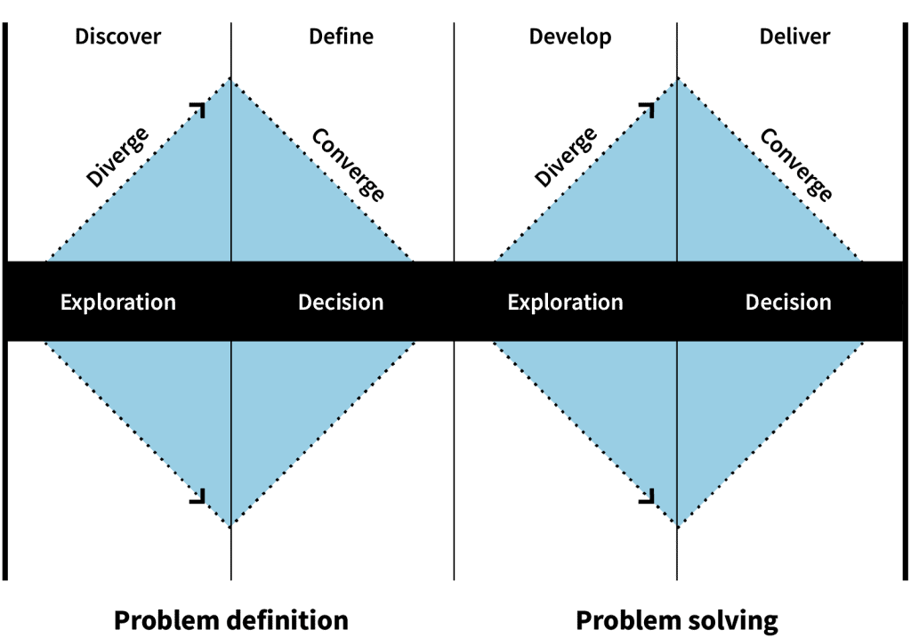
We used a series of workshops and methods to help define our outcomes for the project. Each of these techniques on their own was insufficient to address the challenge we faced, but when combined they provided a cohesive direction that allowed us to make progress and launch the rebrand.
Methods and frameworks that helped us make complex and emotional decisions in a more rational way:
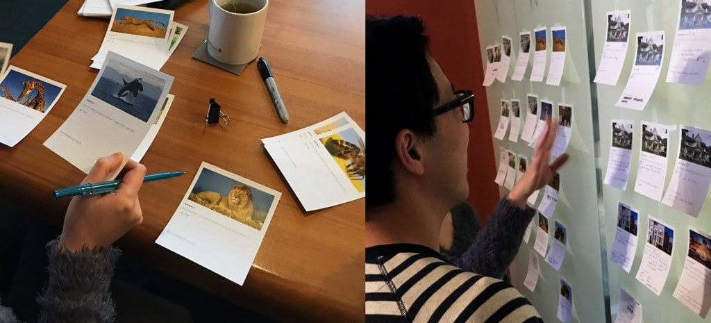
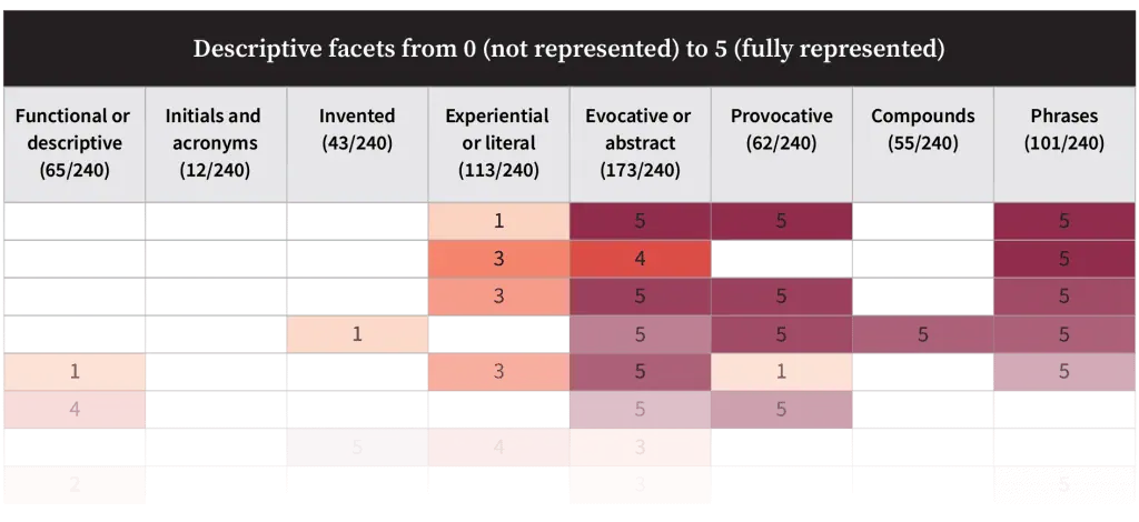
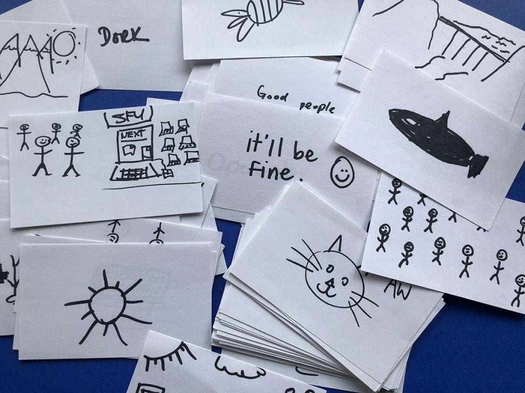
Brand personality workshop
This one-hour workshop helped our staff articulate their feelings about the character of their company, yielding hundreds of useful descriptions and keywords that would inform later processes.
We gave employees a series of cards with images, and asked them to decide whether or not each image was a good reflection of the company, explaining why or why not. They filled out a template and shared their results on a whiteboard.
Competitive namespace analysis
Our internal audience expected us to apply the same amount of rigour in our naming and branding process as with any client, so we chose to score name ideas quantitatively. Our namespace analysis evaluated competitor names by type, and tested possible names within this context. We then looked at this analysis as a heatmap that revealed areas of opportunity, where the trends were, and spaces that our competitors’ names didn’t occupy.
Brand interviews
We designed our research interviews to reveal what clients, staff, and the market had thought of us when they first heard about us and how our brand was perceived in the local market. This gave us information about first touch impressions and market awareness.
The interviews were conducted over the phone and in person. The information—both positive and negative—was logged and analyzed along with other data inputs to help us develop a more complete picture of the company’s reputation.

Rebrand naming jam
This intense workshop with over a dozen staff from areas all across the company consisted of several cycles of diverging ideas and converging decisions to generate and refine hundreds of name ideas. It was a tightly-planned creative process with activities designed to help people free-associate in unexpected directions.
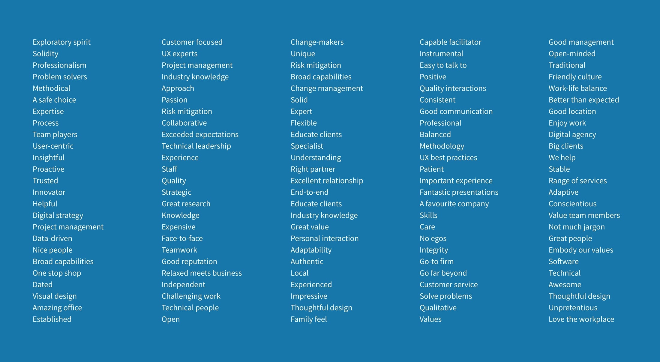
Word and theme analysis
Based on the outcomes of the previous workshops and interviews, we had a broad set of keywords that represented how people viewed the company. We began analyzing that data for patterns using various spreadsheet and database tools.
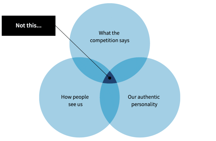
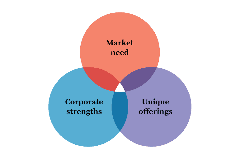
This analysis helped us look for macro-trends in various data sets. This data, when interpreted, revealed the overlap of our authentic personality, what the competition says about themselves, and how people see us. Looking at this confluence, we could start to see where we should be positioned, and how our new name and brand should be perceived.
Synthesizing a brand strategy
Combining our research data points—how we describe ourselves, how others describe us, and our position within the market—helped us uncover meaningful and authentic descriptors that informed the rebrand strategy.
Prototype a name
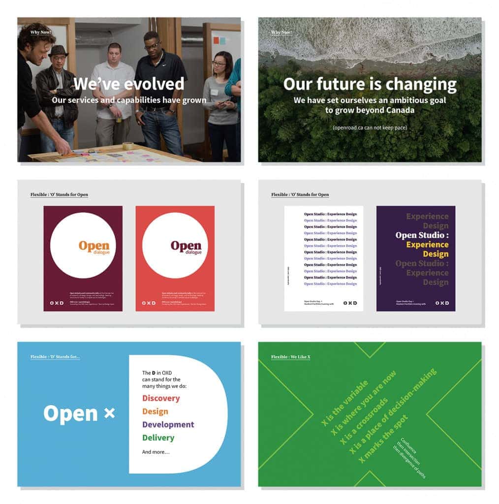
We produced high-fidelity mockups to demonstrate how a potential name might be expressed in an identity across media. An initial art direction document explored how the brand might perform at different scales and in multiple contexts. It also helped us get staff excited about the possibilities.
Converge.
The brand “big idea”—Converge—arose as the different parts of our brand strategy came together. Our values, positioning, messaging, and personality all informed the big idea, which, in turn, inspired how we would bring those strategic elements to life, driving the creative direction and visual identity.
Make New Experiences Possible through the unexpected convergence of people, approaches, and technologies.
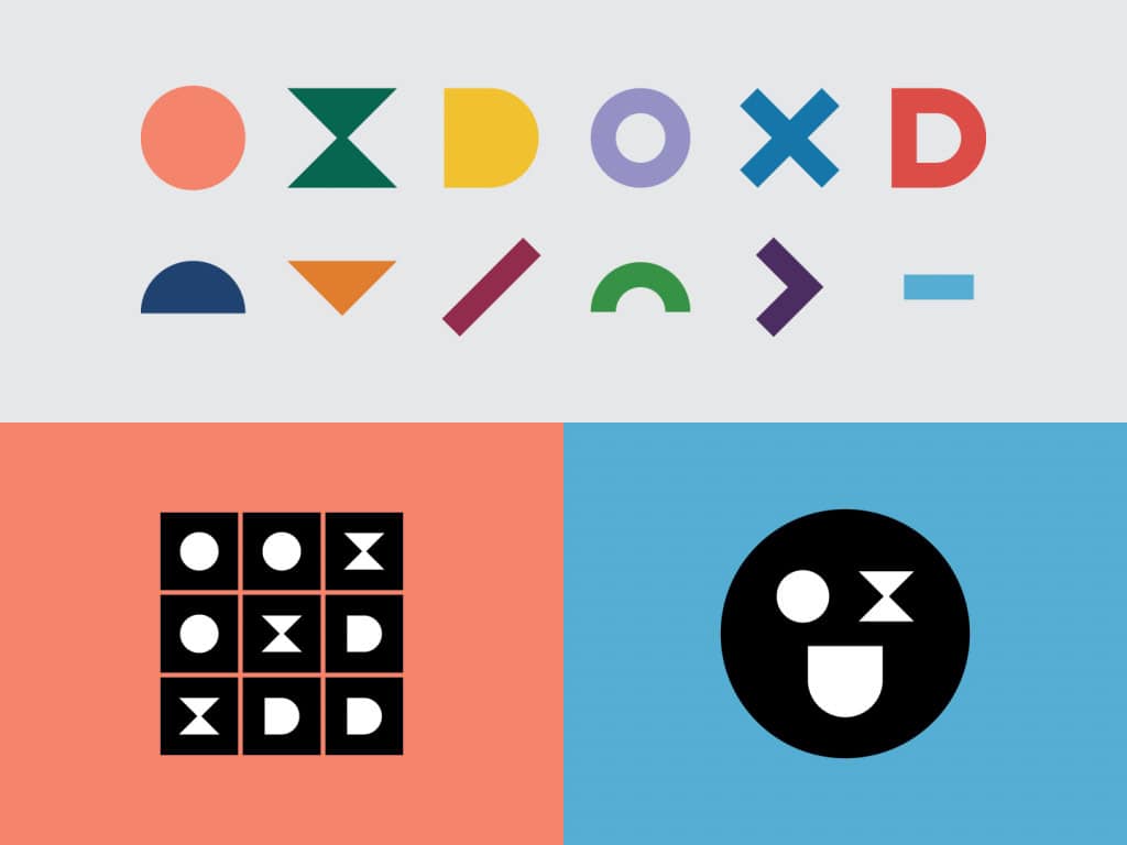
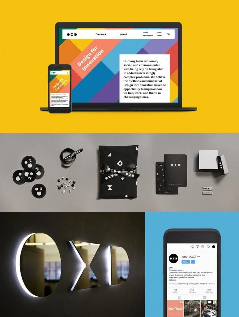
Logo
The OXD logo is the convergence of bold, elemental shapes that reproduce well at various scales, favouring timeless geometry over trends of wordmarks, dots, and periods. Rapid iteration of hundreds of logo directions quickly narrowed down what worked within the context of our brand strategy.
Colour
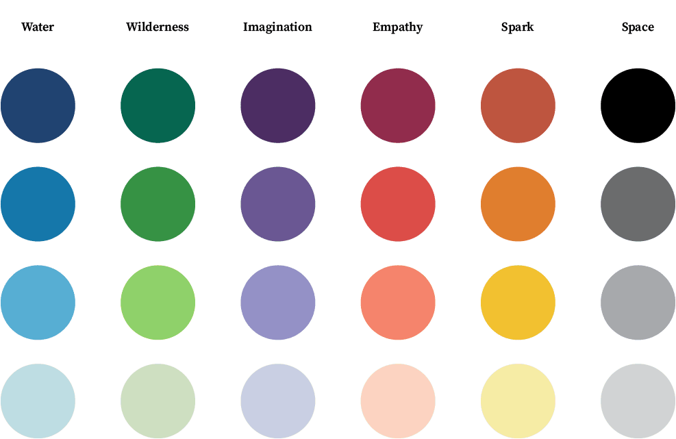
With a competitive landscape full of hot pinks and blood reds, we created a bright and refreshing palette that distinguished OXD while capturing a diversity of applications. Instead of designing digital- or print-first, we shaped our colour palette with both digital and physical applications in mind from the outset, paying careful attention to accessibility, particularly around the legibility of colour combinations.
Type
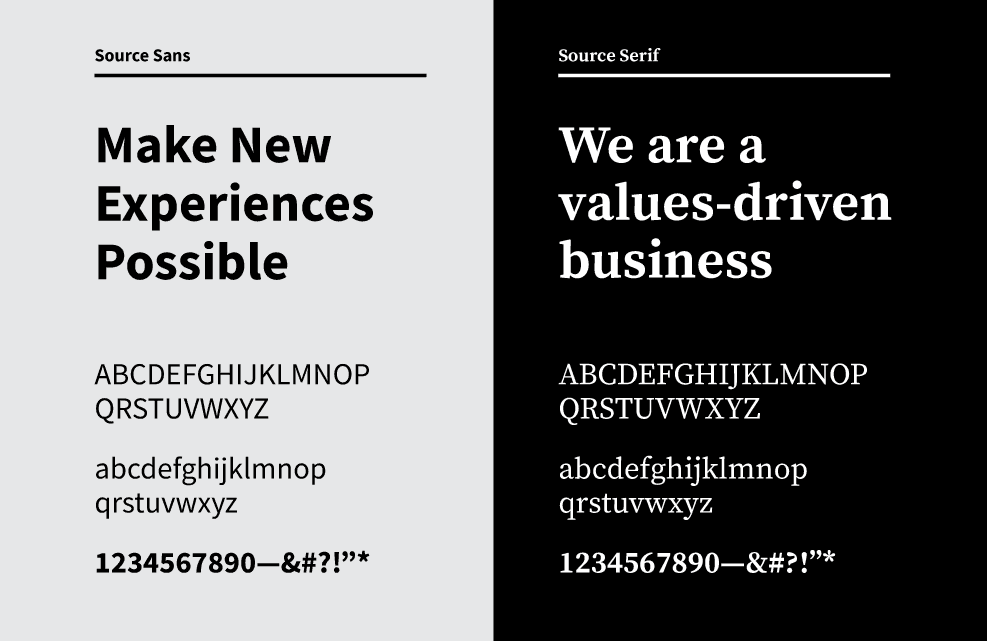
For our new brand to be applied consistently, it had to be replicable by non-designers across the company. That meant choosing fonts that were easily installed and usable in all the ways we work—which include G-Suite applications. Our font was chosen for its ubiquity and variability—easily found and installed, but malleable enough to create a distinct look.
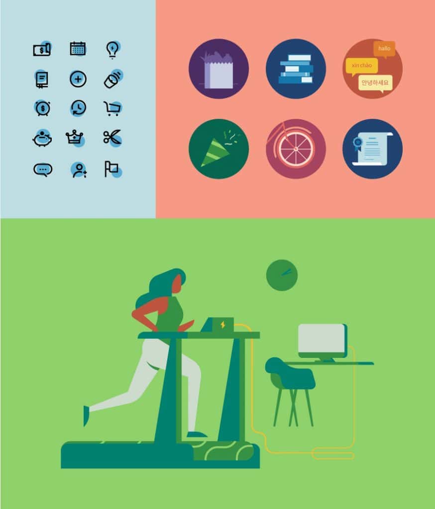
Brand system
Our brand needs to cover a broad tonal range, from serious to playful. We developed assets and templates with a distinct “kit of parts” mentality.
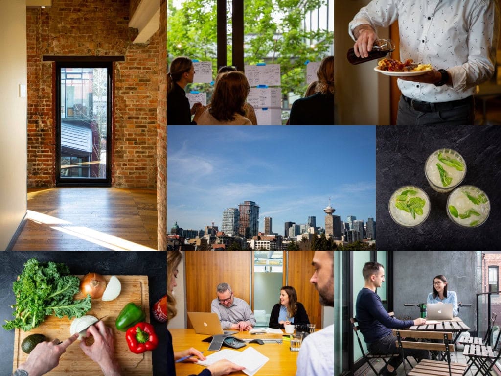
Iconography, graphics, and photographic direction play a key role in expressing the creative direction and brand strategy. Since the brand launch, we’ve continued to expand and evolve the illustrations, even developing a “people colour palette” that helped ensure that our illustrations are as diverse and inclusive as possible.
Thinking beyond the visual.
Throughout the brand process, the strategy informed both our visual approach as well as how we sound as an organization.
In order to create an authentic voice and tone for the brand, we audited and analyzed existing communications to uncover what characteristics best defined our collective voice.
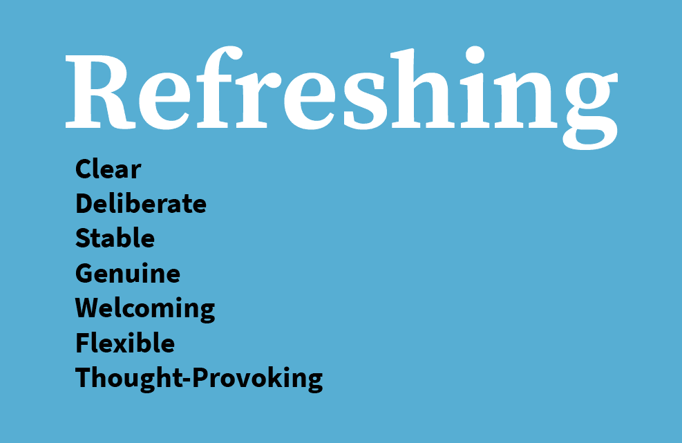
Our comprehensive editorial guidelines provide guidance around how to sound like “us”—human-centred, humble, friendly.
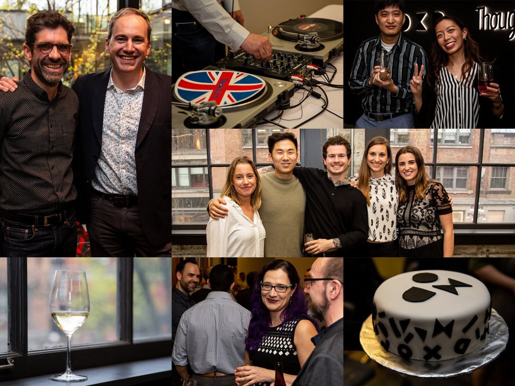
Rolling out a new brand after 23 years.
Very few people outside the company knew that the rename and rebrand was coming, until the day it happened. That made for a tricky transition. We planned a simultaneous, single-day rollout that required clear and constant communication, cross-team coordination, and the ability to be nimble with any setbacks.
The new OXD website was undoubtedly the centrepiece of the digital rollout. But there were hundreds of other elements to consider—social profiles, third-party applications, industry lists, as well as our own employee’s email addresses, signatures, and social presence. All these areas became the proving ground for our refined editorial style.
We designed our brand to work in a variety of contexts beyond digital, including signage, printed collateral, and physical products.
Living the brand.
The brand work doesn’t end at the rollout. In fact, it never ends. The brand is a living thing, always growing and changing. We encourage our staff to be both guardians and champions of our brand as it evolves and matures.
Brand strategy and visual identity guidelines
Our visual identity is a fluid resource that’s accessible to everyone in the company through our intranet and Google Drive.
Editorial guidelines
We continually refine and update our editorial guidelines, accessible on our intranet, as new questions and situations arise.
Google template library
We ran staff workshops to explain the brand strategy, how to use the brand, editorial styles, and our library of document templates.
Image bank
Our evolving image bank supplies everyone in the company with all the on-brand photos, illustrations, infographics, graphs, and icons they need for their client and internal communications.
The work done to overhaul all the materials has been amazing to witness. I’m always proud to hand out a business card.”
OXD staff
One year later, and I love the brand even more. I truly believe it positions us as the world-class consultancy we are.”
OXD staff
Considering a rebrand or need a brand strategy developed? Contact us for help.