
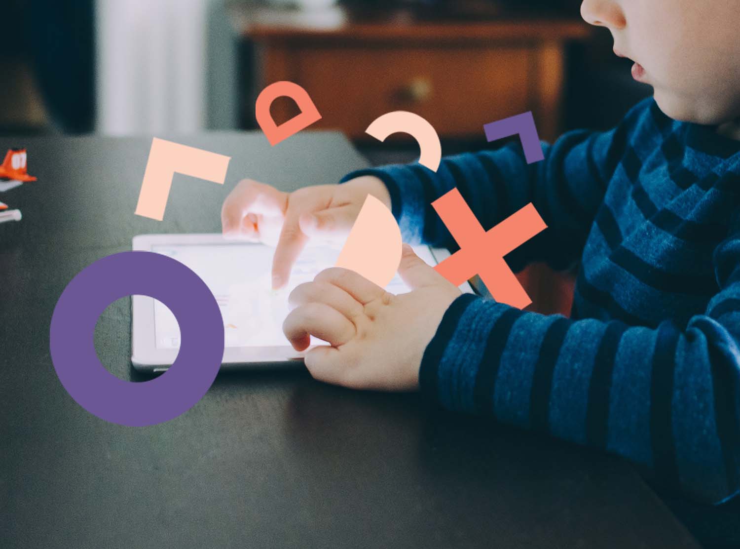
If you’re a parent and you haven’t ever given your child your smartphone or tablet, we envy your discipline. However, you might be missing out if you’re developing a mobile app or website. Sure, a toddler isn’t your actual audience—they’re more the “disinterested-but-will-take-a-look-in-case-there-are-Sesame-Street-videos-on-here” persona. However, that’s a pretty good fill-in for a persona you may already be targeting: the “skeptical-but-will-look-around” user.
It’s interesting to see when they get stuck and when they’re able to move from one step to the next. Eager to experiment, we gave an iPhone to a toddler and paid close attention. Here’s what we noticed:
1. Even toddlers want a clear call to action.
Our toddler tester ignored any call to action that wasn’t a button. In fact, they got tripped up in the iOS Photos app after clicking Select and getting stuck in that screen. In other interaction patterns, clicking elsewhere usually escapes or closes, like clicking on the main screen closes a slide out menu. Our tester didn’t notice the Cancel button and relied instead on a “Dadda fix.”
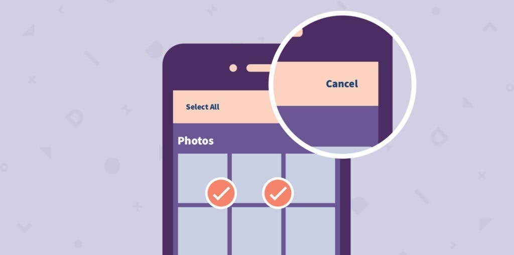
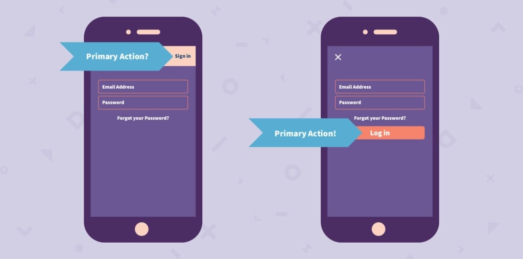
Takeaway: Make your primary actions obvious.
2. They know the norms, and they have expectations.
Even toddlers expect the back button to be on the left side of the screen. We watched our toddler tester click through multiple apps and always assume the back button is at the top left. This is so standard in most mobile apps, that even a toddler will be frustrated when the back button isn’t where it usually is.
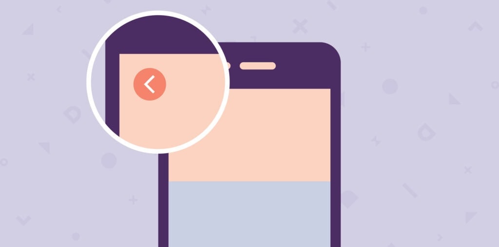
Takeaway: Try to avoid making your users learn a fancy new navigation pattern. Go instead with what they already know.
3. Toddlers don’t read warnings or alerts.
Not unlike many adults, their reaction to a pop-up is looking for the first button that will make it go away. Perhaps not surprisingly, the toddlers we know can’t actually read. Most users won’t read, or get scared off by security access warnings. In iOS, if a user clicks Don’t Allow, it takes multiple steps in Settings to enable that permission for the app later. That is a Herculean task to ask a user to complete. It’s easier for the user to ignore that feature, or the app entirely.
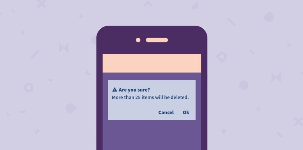
Takeaway: Onboard permissions before the security warning appears, showing a pre-permission dialog box that better informs the user, in context, why the permission is needed. If your end user is a toddler, ignore this.
4. Toddlers can find bugs.
Often this is due to the chaotic nature in which they tap everything. They’re impatient and tend to rapidly tap buttons if something doesn’t happen right away. Sometimes this causes screens to flash and load twice because there may have been a loading delay with the first tap.
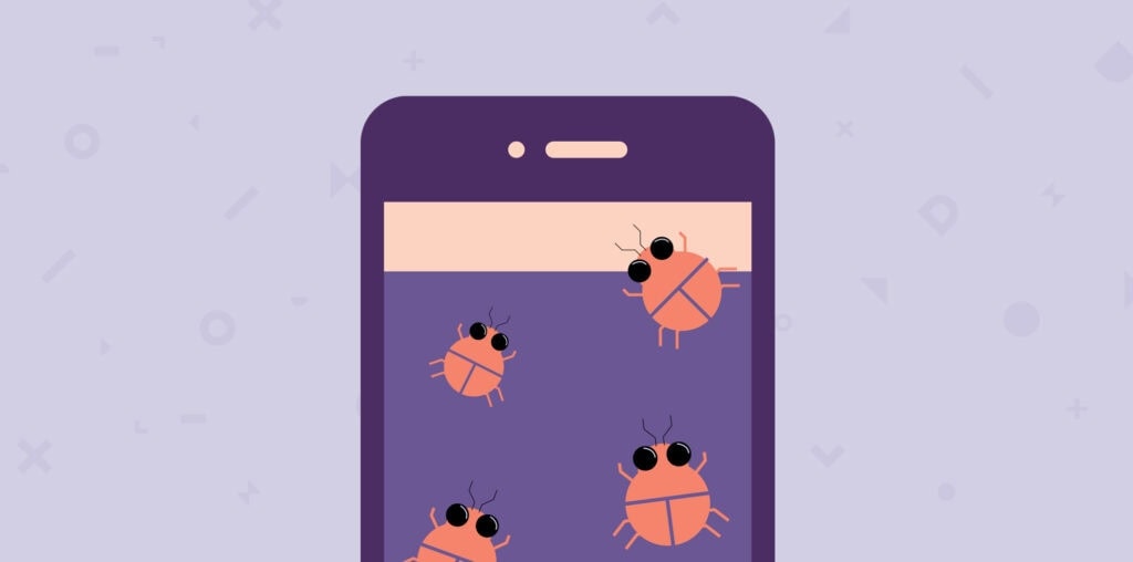
Takeaway: Test for non-typical users too. Most users won’t tap as rapidly as a toddler, but we have seen users who still double-click buttons on websites because it’s an interaction pattern they first learned on their Windows 95 desktop machines.
Perhaps not surprisingly, these observations align with mobile best practices. A good business application is one that allows its users to complete tasks with ease. Usability testing is a great way to get a sense of how actual users will use your mobile app or website.
Do you have an app that requires usability testing? Get in touch with our team of usability experts today, we can help you evaluate your app and write reports with key findings and recommendations. Things toddlers can’t do.
Read about our work supporting the usability testing of the COVID Alert contract tracing app.
Editor’s Note: This is an updated and condensed version of a post first published in 2015 by Pinder Johal.