
FortisBC is an electricity and natural gas distributor in British Columbia. As a subsidiary of Canada’s largest private utility company, they serve 1.2 million customers across the province. In 2017 FortisBC partnered with OXD on their public website redesign.
FortisBC worked with OXD to improve customer service with a customer-centric website redesign that reflected their brand.
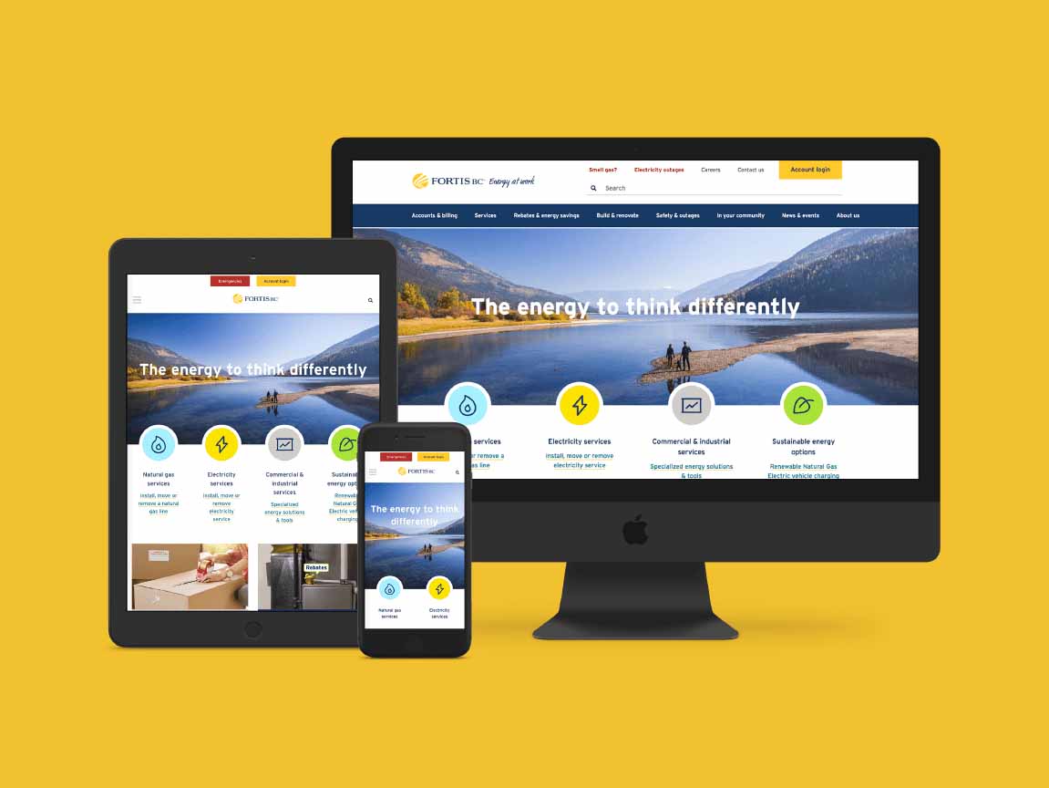
It was time for a redesigned fortisbc.com.
Customers couldn’t find what they were looking for.
Customers came to the FortisBC website to accomplish tasks, for example find bills, change passwords, and update account information. Unfortunately, they were often unable to accomplish these tasks. The website wasn’t responsive, the search function didn’t generate relevant results, and context (customer type and geography) wasn’t taken into account.
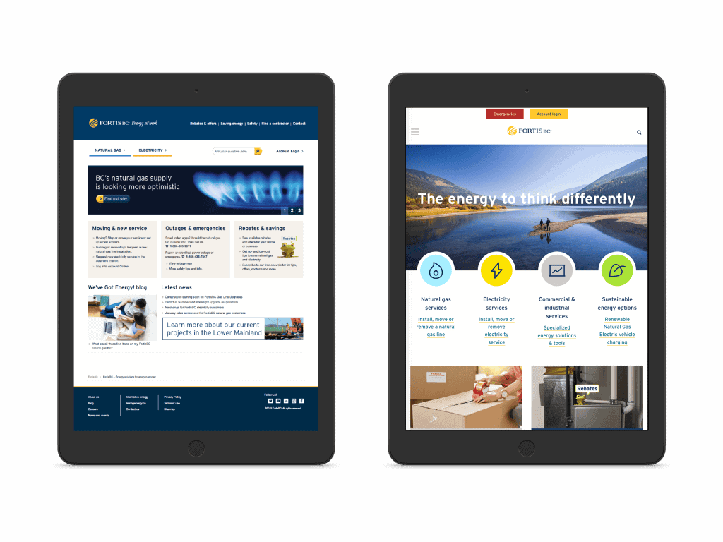
The information architecture mirrored their org chart.
Different business areas within FortisBC were responsible for different parts of the website and the site had been structured from that organizational point of view. For example, like FortisBC’s internal teams, all content was split between gas and electric. This emphasis on service areas and offerings made it hard for customers—who were visiting the website with the aim of completing specific tasks—to navigate the site. Customers struggled to find the right information, which resulted in a high volume of calls to FortisBC’s customer support centre. This was costly to the organization and time consuming for customers.
Siloed teams were creating inconsistent content.
Internal teams at FortisBC had a strong sense of ownership over the website because each business unit was tasked with producing content and providing timely updates to customers. However, there was no system in place to ensure consistency and the content and page layouts varied considerably based on which team produced them. While this worked well for internal teams it resulted in a poor user experience and undermined the FortisBC brand.
How to create a customer-centric website redesign that’s easy to maintain in the long-term
Talk to customers.
We started this project with an in-depth discovery phase to gain insights directly from users into how the website experience could be improved. We conducted interviews, sat in at the call centre, and facilitated co-creation and strategy workshops, produced customer archetypes, and created journey maps that brought the highs and lows of the customer journey to life. Armed with these moments of truth, we were able to align opportunities and audiences.
Reorganize the content with the user in mind.
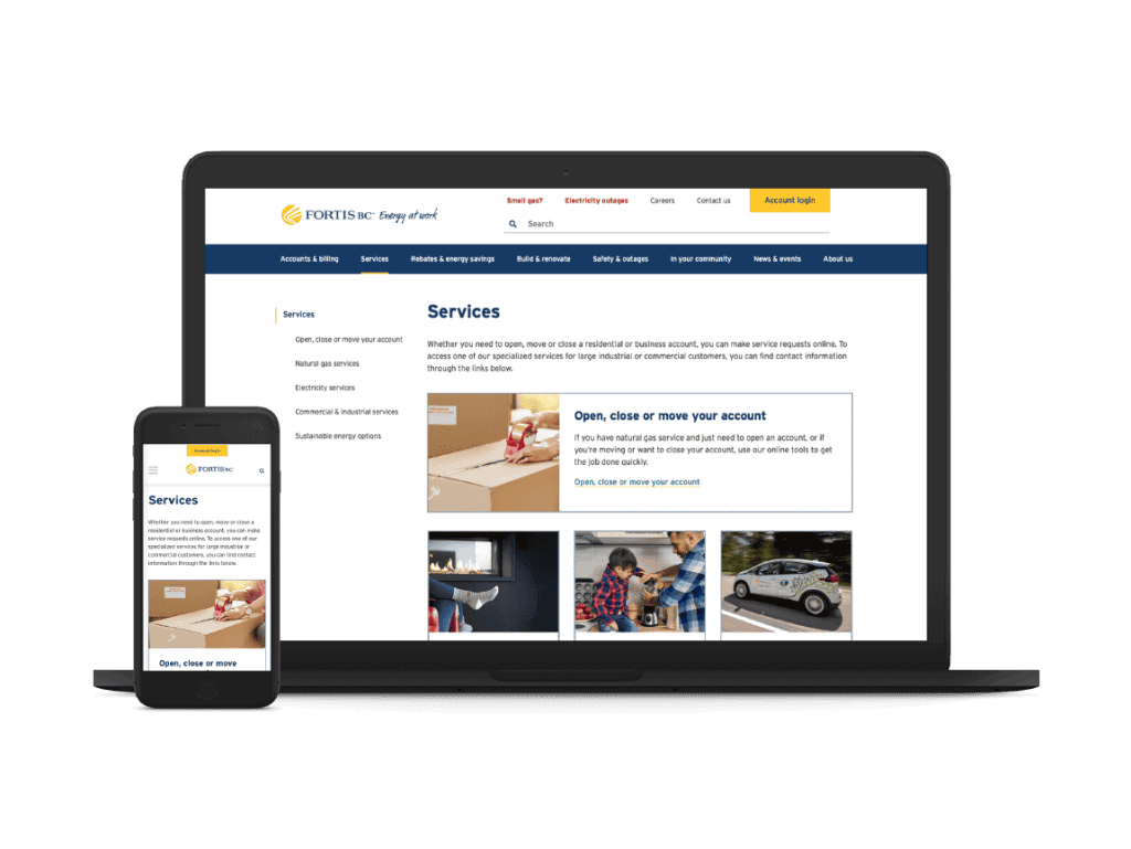
Applying our findings from the discovery phase, we created a new user-centred, task-based information architecture (IA). We produced this new IA with task testing and card sorting, then validated it with usability testing. The new information design brought all of FortisBC’s services together and made all the important content accessible both through the navigation and on the homepage.
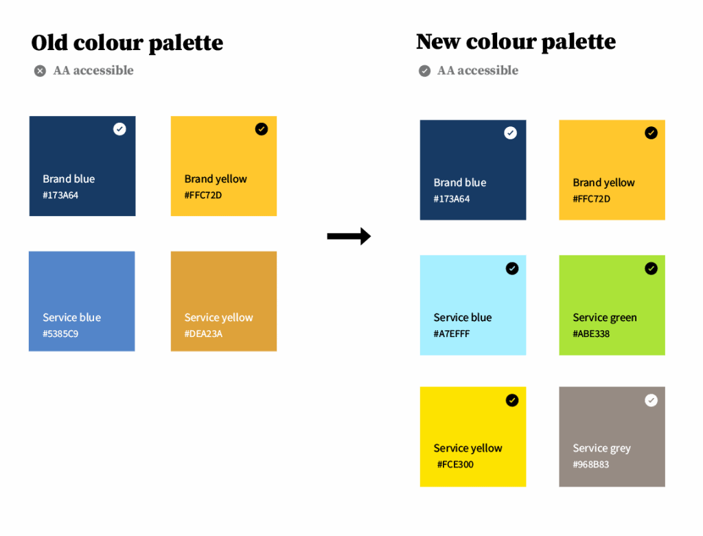
Refresh the brand for vibrancy and accessibility.
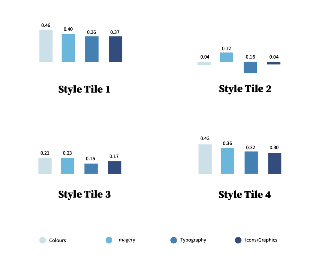
The FortisBC brand is rooted in expertise, trust, approachability, and innovation. Our Creative team expanded their brand to be WCAG AA compliant, while maintaining FortisBC’s core brand character. We used the findings from our discovery research and conducted a comparative review of similar industry sites and other FortisBC properties to produce several brand-driven visual directions, or style tiles, that set the direction for our initial designs.
Test resonance.
Too often, visual design decisions are made on the basis of personal preference or subjective opinion. We helped FortisBC choose the best solution objectively using quantitative testing methods. By facilitating emotional resonance testing at scale, we validated which of our creative solutions best conveyed the attributes and tone that supported the FortisBC brand.
Be author friendly.
We gave FortisBC staff the flexibility they need to manage the site by designing a brand system and layout patterns that are replicable by non-designers. Our modular design and layout enables staff to tailor content to different customers and business needs.
Embrace out of the box.
We replaced FortisBC’s instance of SharePoint with Sitefinity CMS and opted to use as much out-of-the-box functionality as possible. This makes the site easier to maintain and reduces the risk of code breaking during upgrades. Our Creative, User Experience, and Development teams collaborated closely to understand and design the site to employ the CMS’s capabilities.
Be flexible.
We took a hybrid project management approach that merged elements of both waterfall and Agile methods through a gated process. This helped us work with our fixed timeline and budget, while still embracing changing requirements and managing expectations. We took a waterfall approach through the Discovery, UX, and Visual Design phases but then used an Agile project management methodology for the Development phase. While we worked in sprints and held demos during development, we still had a formal user acceptance testing (UAT) period at the end of the project.
The finished product
Consistency that benefits both customers and staff
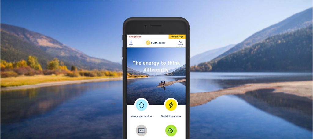
The implementation of a modular, third party CMS has helped the internal teams at FortisBC produce content that is consistent with their brand guidelines. The out of the box development approach also means that staff can push changes to their production site without technical support. As a result, staff can make timely content updates without relying on a designer and customers can move through the site with increased ease because the design is predictable. While previously things looked different from one page to the next, which made navigation a challenge for customers, now the FortisBC team has a style guide to inform how to use the different components in their new CMS.
Design that reflects the FortisBC brand
By introducing FortisBC’s secondary colour palette, creating new icons, and producing a new art direction for their photography style we were able to help FortisBC bring their website in line with contemporary web design practices. The redesigned website uses established design patterns and layouts that are usable on mobile and larger screens. The finished product is bold, fresh, and approachable while still meeting the Web Content Accessibility Guidelines.
Planning your own website redesign or design and build of a new website? Download our website project planning guide or contact us today.