Like most people, my usual goal setting pattern goes something like this:
- Set goal (“I’m going to run twice a week.”),
- follow through on goal for about two to three weeks,
- come up with excuses so I don’t have to run anymore (“My ankle kinda hurts and Netflix is particularly great lately.”), and
- forget about goal.
But recently I discovered Google Goals (a feature built into Google Calendar) and shortly after I noticed a significant change in my pattern. I was more motivated to run, I saw an improvement in my commitment, and I even started setting other goals. Play guitar, stretch, read—I was on it!
Which got me wondering… Why has this app been more effective for me while others have failed?
I began to notice how the app itself offers incentive through the strategic use of illustration. Using illustration, it was guiding (luring, actually) me towards my goal, one step at a time. Which then got the designer in me thinking: How else can illustration help improve the experience of a product? How can illustration affect the user experience?
Let’s take a look at how illustration is used in web and application design today.
Illustration influences user emotion.
Digital products have found their way into all areas of people’s lives—walking to the bus, waiting for a coffee, and of course the “I can’t fall asleep so I’ll go on my phone at 2 AM” scenario. People’s moods vary and their emotions fluctuate, because, well... you know, they’re people.
So what can designers do to help make sure our audience experiences our products with the right frame of mind?
Illustration can quickly set a specific tone and even show that we sympathize and support our users. A well-crafted illustration can add a sense of humour to lighten the mood during frustrating experiences. As I’ve experienced first hand, an aspirational visual can motivate and even change a person's day.
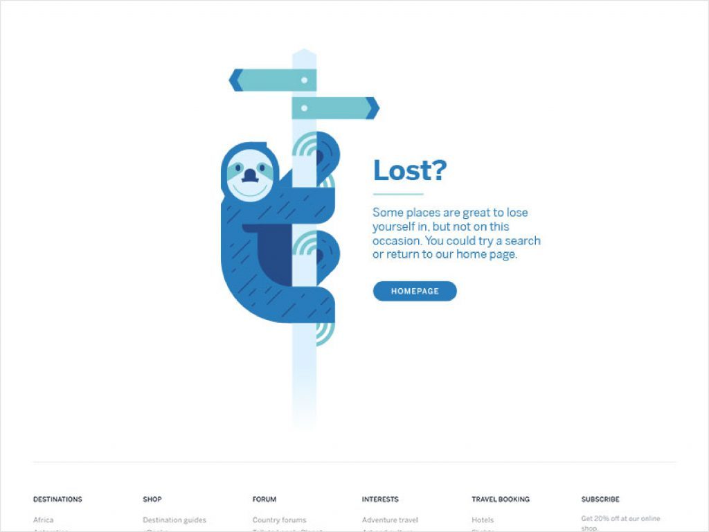
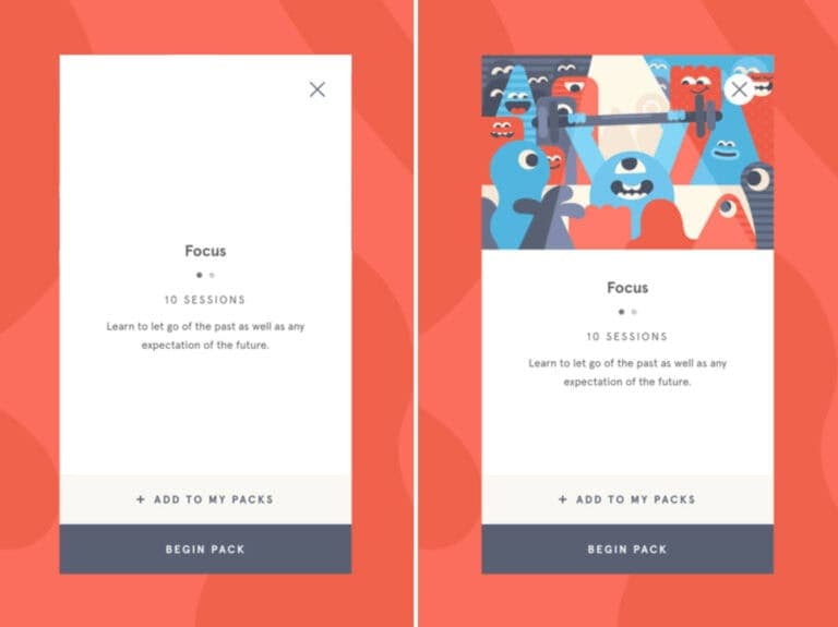
Illustration involves the user.
We want our users to feel involved in the actions they’re taking. It adds a level of comfort to the products we design and the interactions we create. A personal connection. Visualization helps effect the emotional state of users, which can add to the longevity of a product and support interactions by adding anticipation to the outcome.
Illustration can create that connection through visualization. Photography is literal and for the most part, it doesn’t leave much room for interpretation. What you see is what you get. Illustration on the other hand is flexible by nature, leaving room for the imagination to roam freely. It helps the user believe, “this product is for me”.
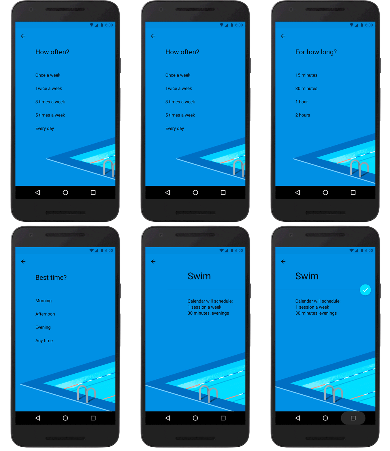
Illustration can be inclusive.
We have people using our product and they feel engaged, but how do we make sure that everyone feels included? As designers, our products are more far-reaching than ever before, and it’s important to design with that top-of-mind.
Of course, that’s much easier said than done. Represent everyone. Everyone? EVERYONE? There are a lot of users out there, how can we make them all feel represented visually?
Illustration—when done well—can be inclusive. Illustration styles tend to be more abstract and can stretch the imagination, leaving things like race and gender open to interpretation. By deviating from traditional human forms and complexions, designers can be more inclusive.
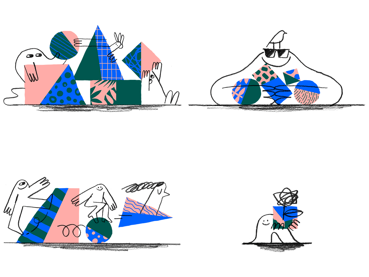
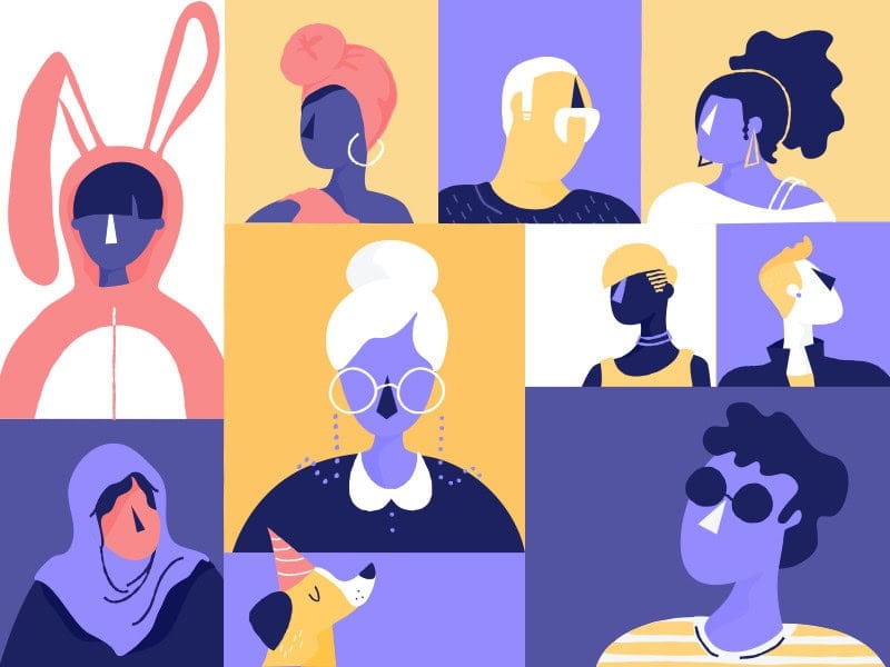
Illustration communicates complex ideas.
The capabilities of modern products continues to grow in power and complexity. Some of these new concepts and features are hard to explain and even harder to visualize. So, how can we quickly demonstrate what our product is capable of?
Illustration! (I bet you didn’t see that coming.) Using illustration you can create metaphors and paint pictures of your products that are intelligible, while quickly breaking the barriers of communication for more abstract concepts.
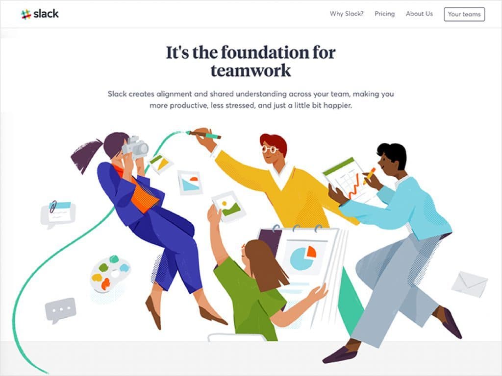
Illustration differentiates your product from your competitors'.
Modern product design has reached a point of maturity where user interface (UI) elements have specific best practices and are expected to work in a certain way. A button can (and should) only be designed so many ways. Commonly-used UI elements should be consistent and recognizable across products.
Because of this, it can be harder to stand out and set your product apart from the competition.
When everyone is using the same user interface elements and behaviours, illustration can influence the user’s experience and create an impression that reflects your unique brand.
If you haven't considered illustration as something worth thinking about in your web or product design, maybe it's time. Illustration doesn't have to be expensive or time-consuming. Like with all interface design, you just need to know what problem you're solving and how illustration as a tool can work for you.
So, the next time you’re having trouble connecting with, representing, or motivating your users, consider incorporating an illustration.
Ready to bring the power of illustration to your next big project? Get in touch with us today.
Editor’s Note: This is an OXD Insight written and first published in 2019 by Josh Herlihey.